
Show Me
The animated chart below is not a simulation, it is reporting live energy consumption data from an actual home.
The information travels from a physical sensor through a residential gateway and out to the cloud, at a service endpoint on our servers. Once the information is gathered it can be presented and analyzed in many ways. (see bottom)
This animated graph shows the average power consumption at different time scales. We can also see a summary in the boxes above. For example, clicking on the Year box, will stop the animation and will show the impact of installing the system for this home, by showing the year over year comparison of energy use. Try to guess when you think the system was installed ! The data is refreshed every few seconds.
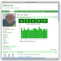
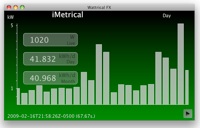
Here we have three other working visual front-ends; a mobile device, a desktop application and a web portal. We have also succesfully implemented views for the video home theater and a digital photo frame.
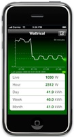
Mobile:
iPhone (short video)
Desktop: JavaFX
Portal: Facebook, iGoogle and Ning,